Global liquidity has long been one of the cornerstone indicators used to assess macroeconomic conditions, and particularly when forecasting Bitcoin’s price trajectory. As liquidity increases, so does the capital available to flow into risk-on assets, such as Bitcoin. However, in this evolving market landscape, a more responsive and perhaps even more accurate metric has emerged, one that not only correlates highly with BTC price action but is also specific to the ecosystem.
Global M2
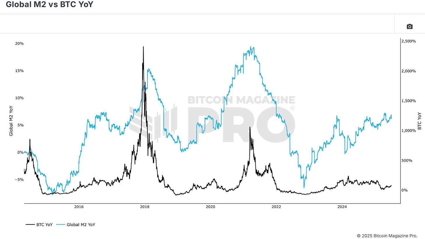
Let’s begin with the Global M2 vs BTC chart. This has been one of the most shared and analyzed charts on Bitcoin Magazine Pro throughout the current bull cycle, and for good reason. The M2 supply encompasses all physical currency and near-money assets in an economy. When aggregated globally across major economies, it paints a clear picture of fiscal stimulus and central bank behavior.
Historically, major expansions in M2, especially those driven by money printing and fiscal interventions, have coincided with explosive Bitcoin rallies. The 2020 bull run was a textbook example. Trillions in stimulus flooded global economies, and Bitcoin surged from the low thousands to over $60,000. A similar pattern occurred in 2016-2017, and conversely, periods like 2018-2019 and 2022 saw M2 contraction aligning with BTC bear markets.
A Stronger Correlation
However, while the raw M2 chart is compelling, viewing Global M2 vs BTC Year-on-Year provides a more actionable view. Governments tend to always print money, so the base M2 supply nearly always trends upward. But the rate of acceleration or deceleration tells a different story. When the year-over-year growth rate of M2 is rising, Bitcoin tends to rally. When it’s falling or negative, Bitcoin typically struggles. This trend, despite short-term noise, highlights the deep connection between fiat liquidity expansion and Bitcoin’s bullishness.

But there’s a caveat: M2 data is slow. It takes time to collect, update, and reflect across economies. And the impact of increased liquidity doesn’t hit Bitcoin immediately. Initially, new liquidity flows into safer assets like bonds and gold, then equities, and only later into higher volatility, speculative assets like BTC. This lag is crucial for timing strategies. We can add a delay onto this data, but the point remains.
Stablecoins
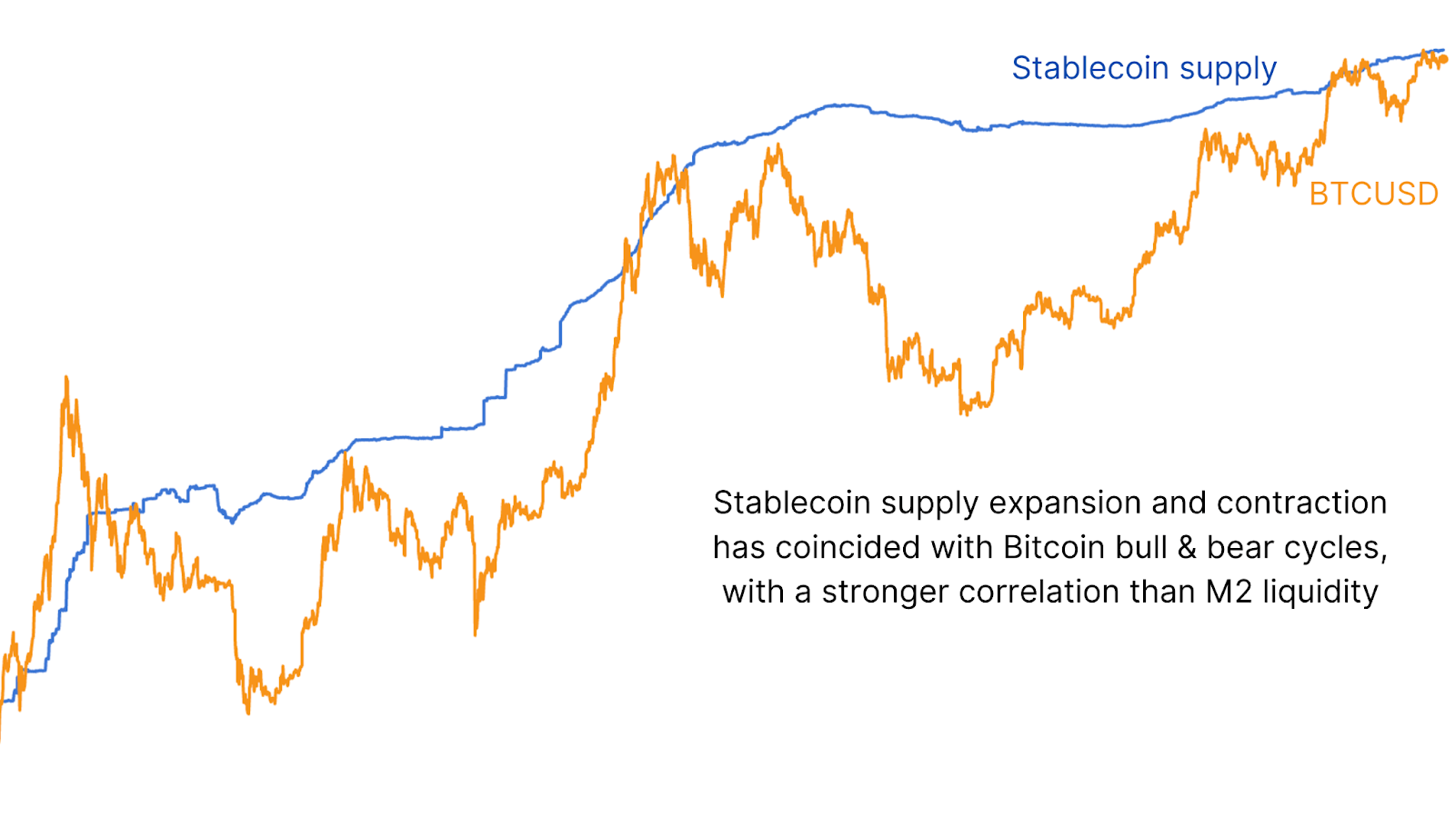
To address this latency, we pivot to a more timely and crypto-native metric: stablecoin liquidity. Comparing BTC to the supply of major stablecoins (USDT, USDC, DAI, etc.) reveals an even stronger correlation than with M2.

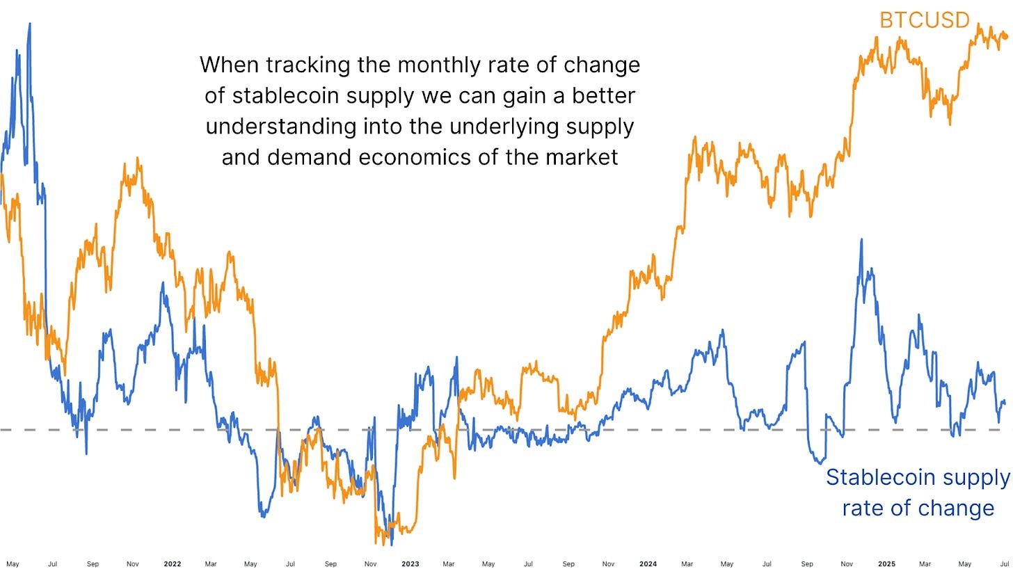
Now, just tracking the raw value of stablecoin supply offers some value, but to truly gain an edge, we examine the rate of change, particularly over a 28-day (monthly) rolling basis. This change in supply is highly indicative of short-term liquidity trends. When the rate turns positive, it often marks the beginning of new BTC accumulation phases. When it turns sharply negative, it aligns with local tops and retracements.

Looking back at the tail end of 2024, as stablecoin growth spiked, BTC surged from prolonged consolidation into new highs. Similarly, the major 30% drawdown earlier this year was preceded by a steep negative turn in stablecoin supply growth. These moves were tracked to the day by this metric. Even more recent rebounds in stablecoin supply are starting to show early signs of a potential bounce in BTC price, suggesting renewed inflows into the crypto markets.

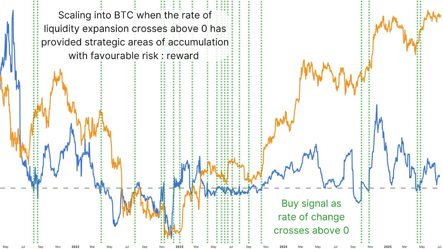
Figure 5: In the past, the indicator triggered by the liquidity rate crossing above zero has been a reliable buy signal.
The value of this data isn’t new. Crypto veterans will remember Tether Printer accounts on Twitter dating back to 2017, watching every USDT mint as a signal for Bitcoin pumps. The difference now is we can measure this more precisely, in real-time, and with the added nuance of rate-of-change analysis. What makes this even more powerful is the intracycle and even intraday tracking capabilities. Unlike the Global M2 chart, which updates infrequently, stablecoin liquidity data can be tracked live and used on short timeframes, and when tracking for positive shifts in this change, it can provide great accumulation opportunities.
Conclusion
While Global M2 growth aligns with long-term Bitcoin trends, the stablecoin rate-of-change metric provides clarity for intra-cycle positioning. It deserves a spot in every analyst’s toolkit. Using a simple strategy, such as looking for crossovers above zero in the 28-day rate of change for accumulation, and considering scaling out when extreme spikes occur, has worked remarkably well and will likely continue to do so.
💡 Loved this deep dive into bitcoin price dynamics? Subscribe to Bitcoin Magazine Pro on YouTube for more expert market insights and analysis!
For more deep-dive research, technical indicators, real-time market alerts, and access to expert analysis, visit BitcoinMagazinePro.com.

Disclaimer: This article is for informational purposes only and should not be considered financial advice. Always do your own research before making any investment decisions.


